Excel Data Analysis with Excel Pivot Tables, Excel Dashboard (Udemy.com)
Learn Excel Data Analysis & Excel Data Visualization with Excel Pivot Tables, Formulas, Pivot Charts & Excel Dashboards
Created by: Skills On Demand
Produced in 2022
 What you will learn
- You will learn about Pivot Tables and Pivot Charts
- You will learn to create 2 interactive Excel Dashboards
- You will learn how to use 20 Plus different Excel Charts and Graphs used in Dynamic Excel Dashboards.
- You will learn how to Design, Format and Style Data Elements
- You will learn 30 Plus top Microsoft Excel Formulas and Functions
 Quality Score
Overall Score : 76 / 100
 Live Chat with CourseDuck's Co-Founder for Help
 Course Description
Excel Charts and Excel Graphs are one of mostpowerful features of Microsoft Excel which allows the users to representnumerical data in Graphical Data Visualization format so that end user gets a better viewof the Information discussed.
In this course
You will learn the Excel Pivot Table and Excel Pivot Chart Function in detail and you will learn how to create Dynamic Excel Charts and Excel Graphs.
We will help you understand how to present your data Graphically on a Dynamic Chart, Graph or 3D Map, to make the information appear in a simplified manner.
- You will learn the Top functions and Top formulas used to Pivot your data.
- You will Learn to create a 2 Dynamic Sales Dashboard
- You will learn how to design, style and format aspects of Excel 2016 are applied on charts, graphs and 3D maps.
- You will use the dynamic graphical representation to display your complex data in an impressive way.
- Learn to customize Layout, Axes, Grid lines, Spark lines, Trend lines and Error Bars.
We will go through, 20 Plus different Chart types used in Dynamic Excel Dashboards , Top formulas and Top Functions, Design and Style Elements and finally you will create a 2 Dynamic Excel Sales Dashboard.
So Lets the Show begin!Who this course is for:
- If you are looking to improve your Microsoft Excel Skills
- If you want to learn how to create Excel Charts, Formulas and Functions and Excel Shortcuts
- If you want to learn foundation of how to create Excel Dynamic Dashboards
- If you create Management Reports or MIS
- Excel users who have basic skills but would like to become more proficient in data exploration and analysis
- Anyone who works with Excel on a regular basis

*Some courses are excluded from this sale. Coupon not working? If the link above doesn't drop prices, clear the cookies in your browser and then click this link here.
Also, you may need to apply the coupon code directly on the cart page to get the discount.
 Instructor Details

- 3.8 Rating
 62 Reviews
Skills On Demand
Skills on Demand is an Online Training Startup focused to provide technical training in subject like Programming, Office Productivity and Visual Creativity.
Whether you're trying to learn a new skill from scratch, or want to refresh your memory on something you've learned in the past, you've come to the right place.
Join our classes on Udemy to upgrade your skill set at the right place, right time convenient for you as we offer stress free E-Learning.
Our courses can be watched 24/7 wherever you are. Most are fully downloadable so you can take them with you. You can also view them on mobile devices with the Udemy mobile app.
All courses have a 30-day money-back guarantee so that you can check it out, make sure it's the right course for you, and get a refund if it's not!
Thank You
SkillsOnDemand
 Students also recommend
-
Microsoft Excel - Online Tutorial for Beginners (2010)
-
0.0 (0 Reviews)
-
 Provider: Chandoo.org
 Time: 1h 30m
Free
 Reviews
- Video Duration:
 5.5h
5.5h - Price: 11.99 Track Price 11.99 Track Price
- Provider: Udemy
- Year:
 2022
2022 - Language:
 English
 - Certificate:
 Yes
Yes

30-Day Money-Back Guarantee
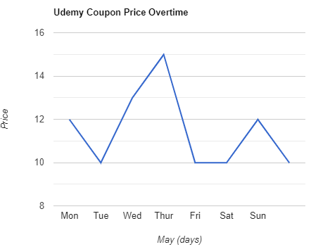
Udemy Coupon Price Tracker